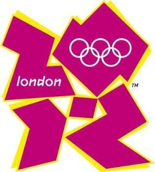
First is the 2012 Olympics logo. It is sad that the organizing comitee is standing by the decision on the 400,000 lbs they wasted on this logo.

Next is the New OKC Thunders Logo.
not as bad as the 2012 olympics logo but still bad.
It looks like a re edited NJ Nets logo. And where is the Thunder? a big downgrade from the Seattle Supersonics logo. It is also too generic,
It also looks like more of a secondary logo than a primary one.
What is the world coming to? Sports in general needs more good graphic artists. Sports officials on the other hand need a lecture on marketing.
But wait!


On the other hand, the New T-Wolves logo looks good. Their secondary logo is a combination of the past 2 logos they had. The main logo had more shadings as well.

No comments:
Post a Comment